Responses Experience
Context
Classcraft is an application that provide teachers with an esssential seesion, the content is the minimum a teacher needs to go thorught to cover the standards as a whole class instruction, in addition to the Classcraft session the teacher gets a teacher guide with a script, and all the aditional resources for offline instructions and group activities for mix and matched profieciency.
During a session teacher will present the content on a classroom panel, like a interactive board or a projector. Students from grades 3 and above would answer the questions on their chromebook and the teacher will facilitate the discussion with the classroom by sharing annonimous students responses and the possible or correct responses to compare with students.
Project Overview
With the introduction of the Math program, and its new Instructional Object (IO) type, our team identified a critical opportunity to re-evaluate and enhance the existing "Responses" tab within our classroom platform. This tab serves as a central hub for teachers to share student responses with the classroom, fostering review and discussion. Our goal was to improve usability, address existing limitations, and streamline the overall experience for both teachers and students.
Using the shape up model and 6 weeks cycles, we had to start with a small scope, so for that phase we would only design for this new Instructional Object called Try It Out, which consist of 8 types of interactions with open and closed ended questions. And we kept a plan to rollback this new design for next releases.
Even though the previous design only fit 2 responses at the type, we learn from observation that the students absolutely love to see their responses showing up randomly and annonymously on the classrrom, causing a mix of excitment and surprise to see what responses would show next.
So we start auditing the current design. So we could identify the weak points to be improved.
Our approach
Current design:
The Responses Tab presented several Key Challenges
Limited Display for Open Text: The design only accommodate up to two open-text responses, restricting comprehensive classroom review and discussion.
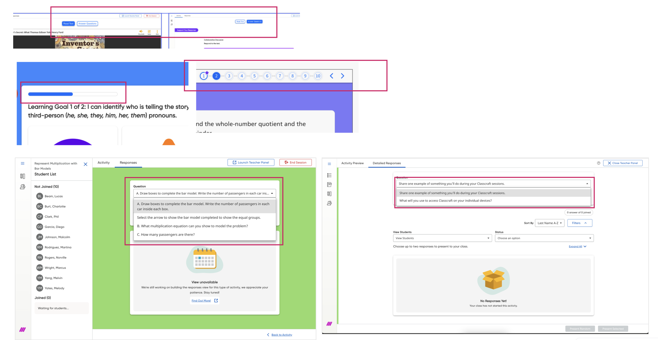
Navigation Issues: Different IOs have different navigation types, and the ‘response tab’ utilize a dropdown menu to select questions, which was different from each IO and also was incompatible with mathematical symbols, leading to failures in loading questions containing complex notation. This hindered access to crucial content.
• Disparate Teacher and Classroom Views: Our current system involved designing and developing two separate panels: a classroom-facing panel for classroom display and a teacher-only panel offering granular student data. While used at different times, the distinct designs contributed to a steeper learning curve for educators as well extra code and design management.
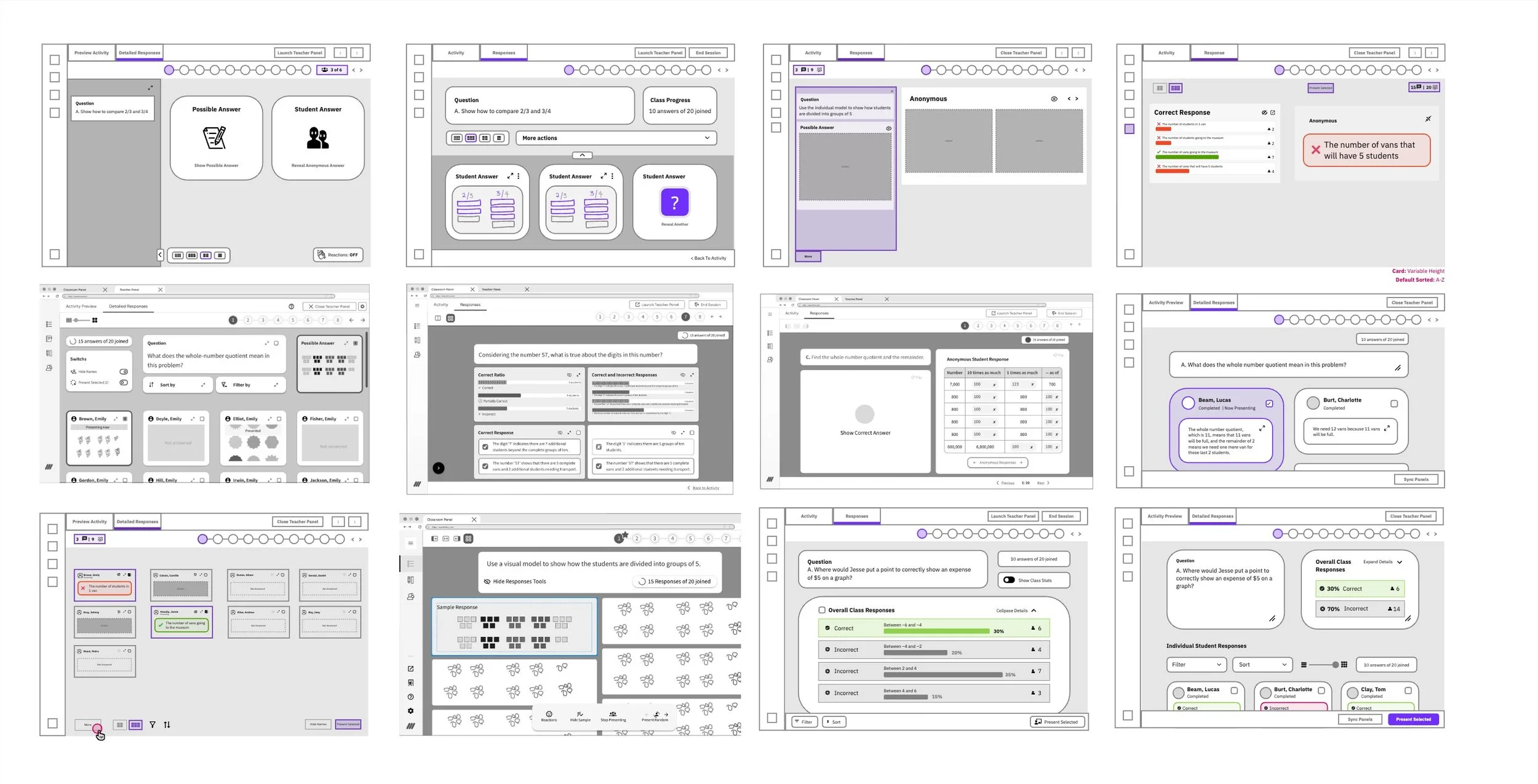
After identify all those key pain points, and all the requirements we started to ideate, wireframing ideas to show anonymous responses and teasing out requrirements and while keeping a similar design to the teacher panel.
The Design Process
After identify all those key pain points, and the requirements we started to ideate, wireframing ideas to show anonymous responses and teasing out requrirements, while keeping a similar design to the teacher panel.
After over 50 wireframes and many hours of heads down, we had a good idea of what we would like to achieve, so we presented the overall idea to stakeholders, which received a very positive feedback.
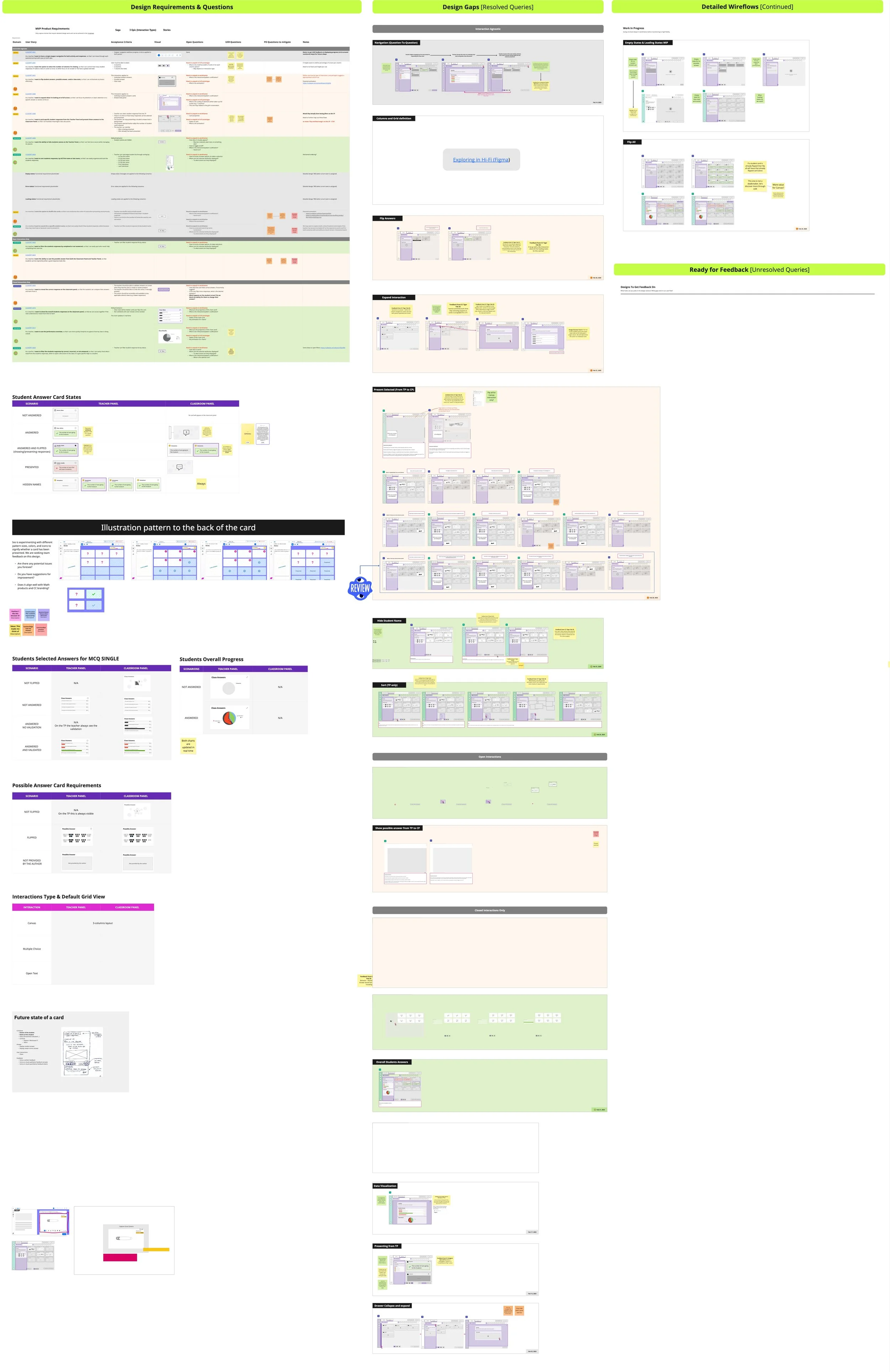
We then created a grid in Miro with User Stories so we would track all the details we needed to discuss with stakeholders
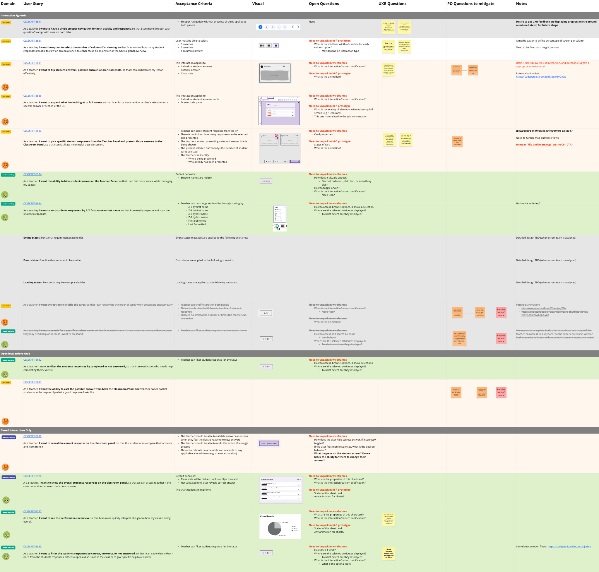
We began probing the design—dissecting each user story, interaction, and feature—and created a detailed wireflow with notes so we could validate our ideas with stakeholders during our weekly meeting. This workflow was invaluable for quickly tackling any design gaps we hadn’t addressed during the ideation phase.
After that we were ready for a mid-fidelity usability test.
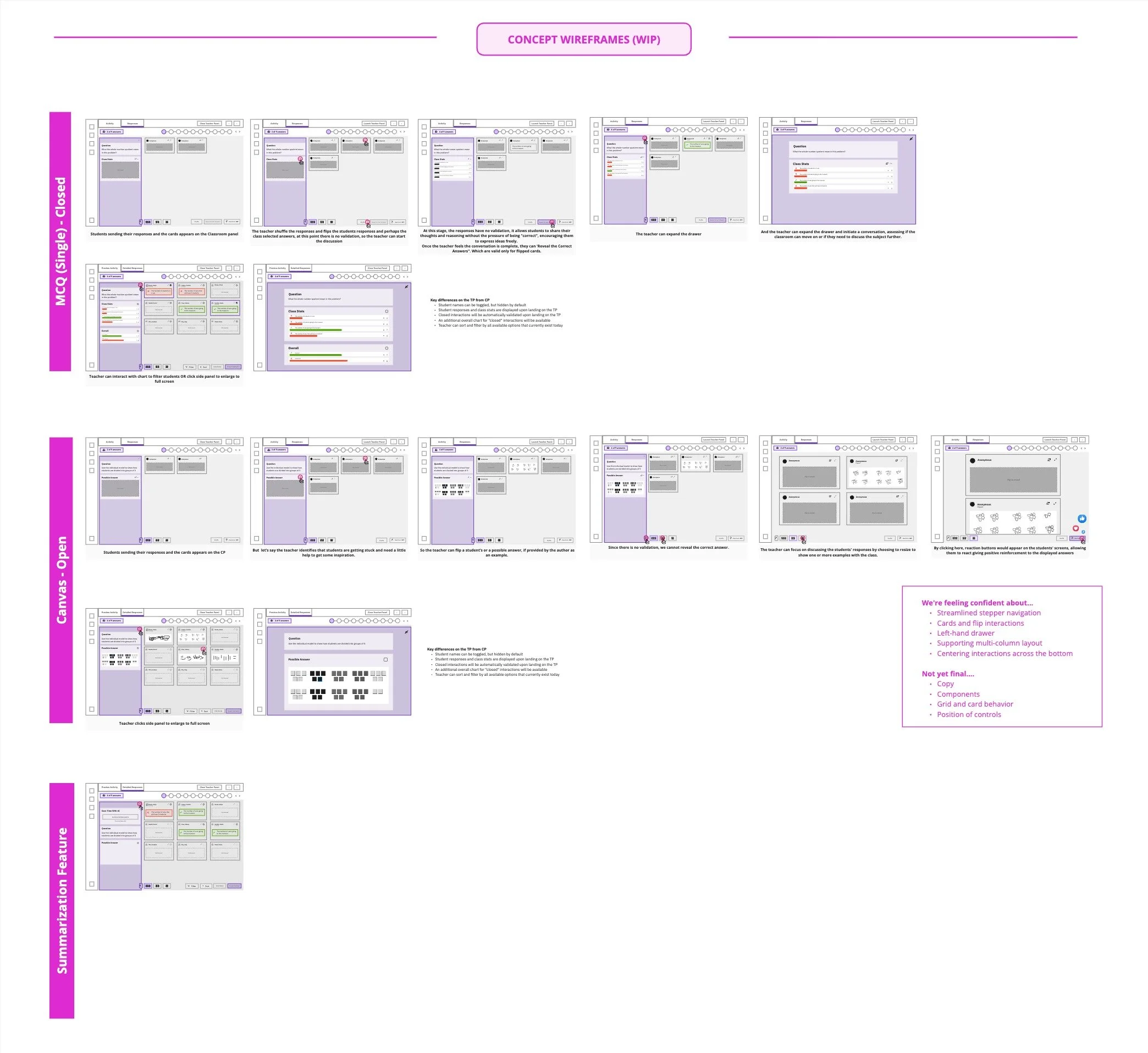
Below are some key insights that needed change from the research, those were target while we moved from Mid-fidelity to high-fidelity.
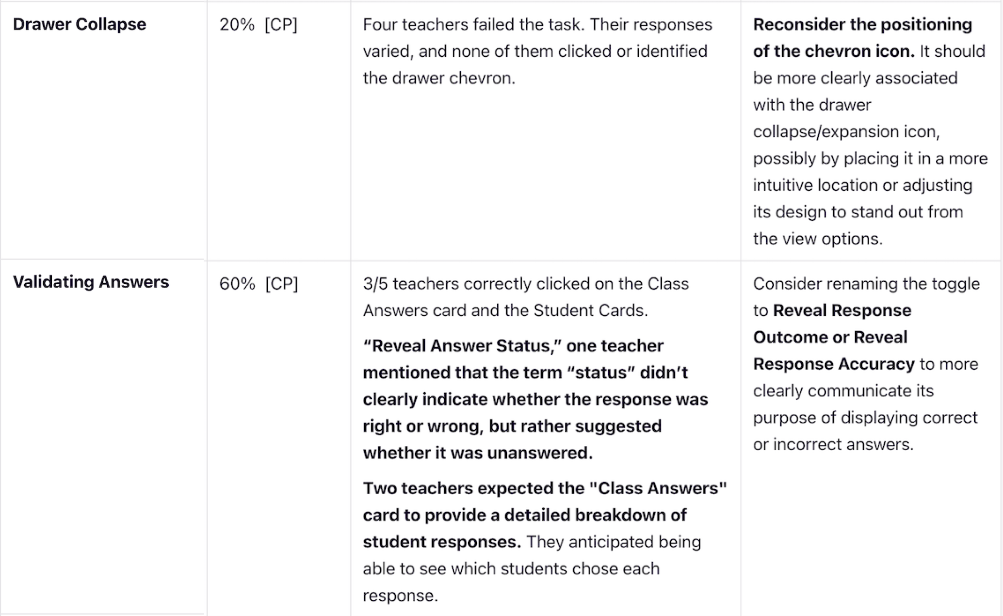
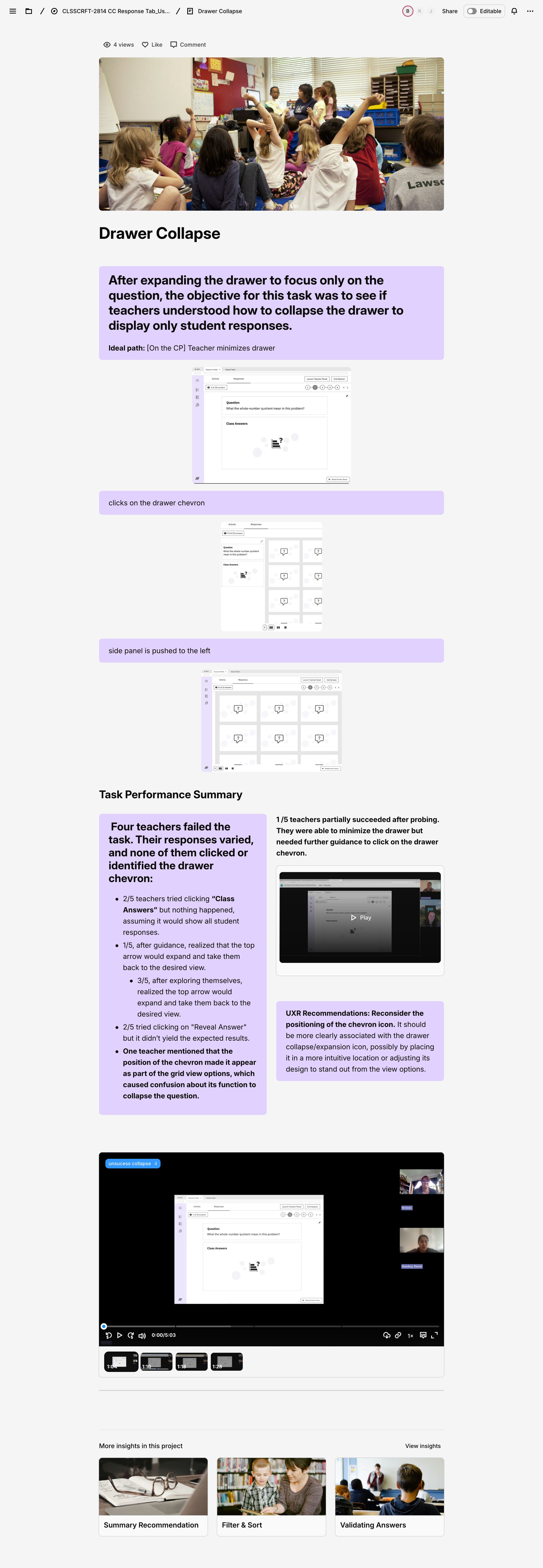
Drawer Collapse
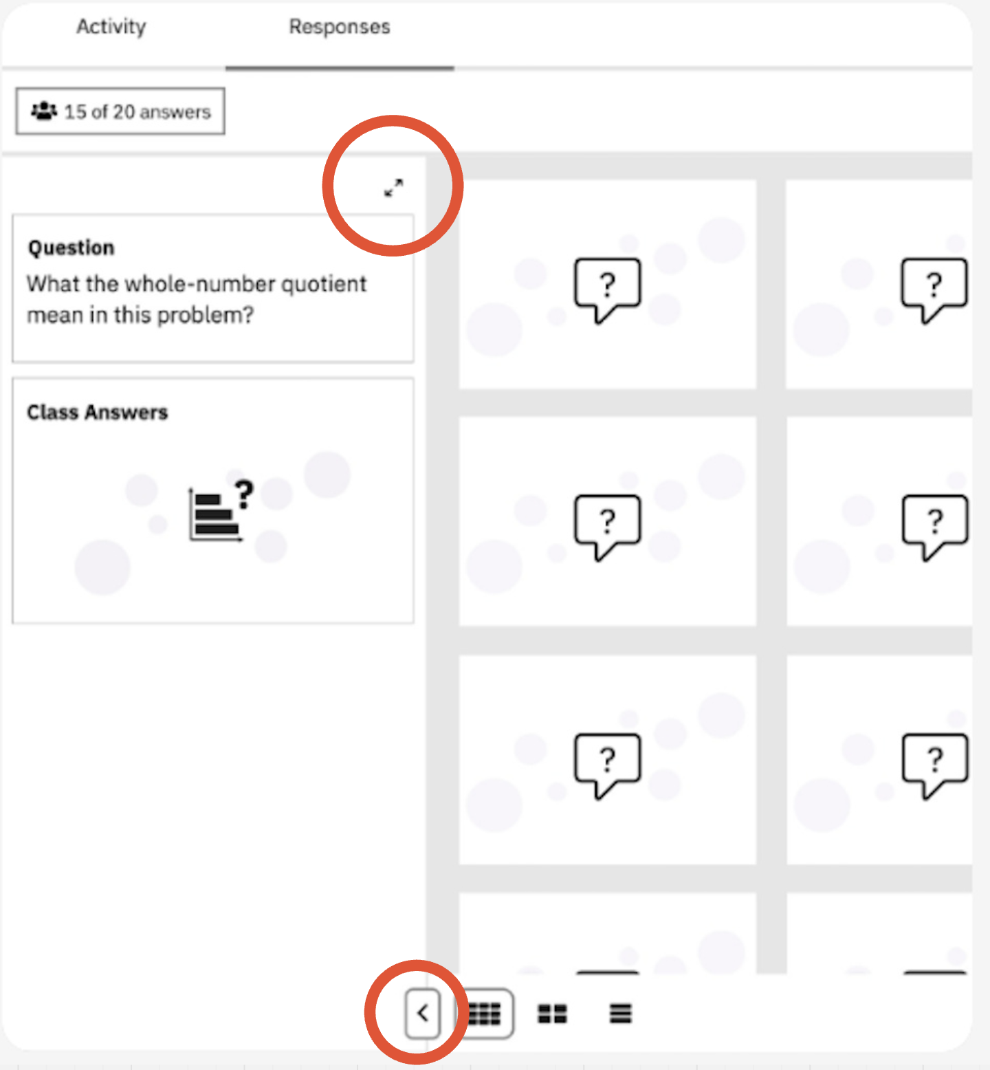
It was a bit of a silly mistake to have the button in two different locations—one to expand the drawer and another that changes position once it collapses. Beyond the inconsistency, we already have an established design pattern for expanding and collapsing drawers on other pages that we should be following. I was glad it failed the test.
Teacher guide, expand and collapse pattern already in production
Drawer updated, to existing standards.
Validating Answers

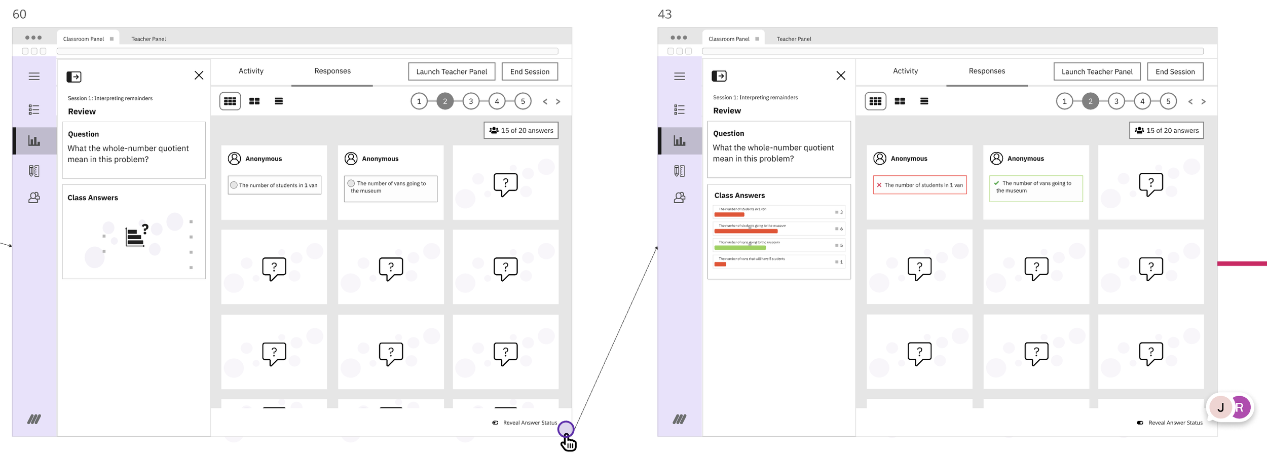
Getting this copy right was a challenge. We wanted to avoid sounding like we were grading answers, but even after brainstorming with the team and consulting former teachers, we didn't quite hit the mark. It ended up failing our user research tests, so we had to go back and update it.
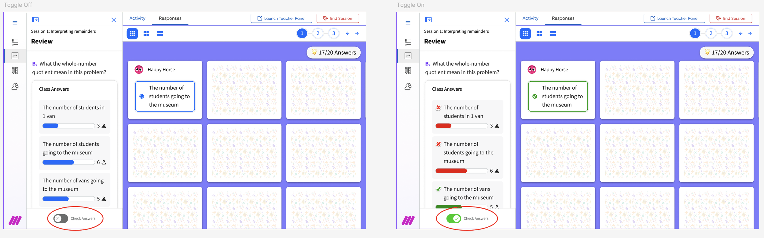
The updated toggle label in the final mock up, position also changed due to scroll considerations.
In addition to the detailed design phase where we addressed feedback from the usability test, we also managed multiple tasks: liaising with the audio-visual team for creation of anonymous avatars, back of the card illustrations; collaborating with our design-system team which happens to be creating a new design system to be roll out with the new branding update; securing CEID’s review and approval of all copy and imagery; and doing accessibility reviews and anotations
Solution
General Flow of final version
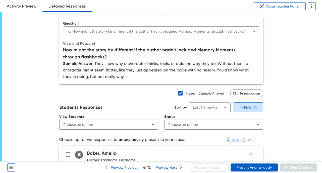
Leveraging the new IO-type navigation in the Responses tab, we introduced a more intuitive and robust way for teachers to move between activities, including those with complex math notation. This redesign directly addressed key usability issues around navigation and response display while improving how teachers review and discuss student work in real time.
Previously, the interface only displayed up to two open-text responses at once, limiting whole-class review and discussion. Activity selection relied on a dropdown that did not reliably support mathematical symbols, causing failures when loading questions with complex notation and disrupting STEM-focused lessons. In addition, teachers had to learn two distinct interfaces: a classroom-facing panel for public display and a teacher-only panel for detailed student data, which increased the learning curve.
A central goal of the redesign was to unify the experience across the classroom and teacher panels, even though they serve different purposes (public sharing vs. private analysis). By aligning their designs, we aimed to:
Reduce cognitive load: Make it easier for teachers to move between panels without “relearning” how to use the interface.
Improve learnability: Shorten the time it takes educators to understand and adopt new features.
Enhance consistency: Deliver a cohesive, professional experience across the platform.
By creating a more seamless, consistent, and math-friendly navigation model, we help educators more effectively facilitate classroom discussions and gain deeper insights into student understanding.
Figma file organized by task for dev handoff.
Monitoring
Achieved a perfect Average Satisfaction Rating (CSAT) of 7/7 (n = 5) during post-release testing, with all participants successfully navigating the new Responses experience and completing the majority of tasks without significant friction.
Demo
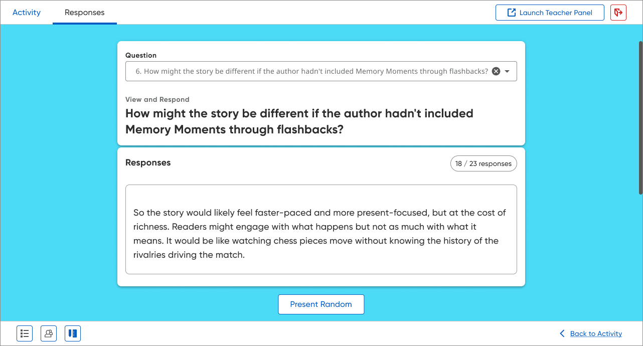
An example of a activity which do not contain a exact answer.